


Quality Assurance metrics are used to determine the testing status and its results. Via metrics, we can track the condition of QA tasks, product quality, and team productivity. Nonetheless, there is a challenging thing: metrics are useful only in context.
To estimate a team’s key performance indicators over some time and plan the testing process, Team Leads need to set QA testing metrics as the main decision points. The choice of metrics, which offer insights into common software application behavior, should be guided by common practices. Thus, QA engineers can find out patterns and bugs that may arise in similar products. QA metrics allow product owners and project managers to obtain a far better understanding of exactly how quality assurance specialists work and to what extent they are doing well.
In this article, we’ll discover how to use software QA metrics to your advantage.
Types of test metrics in software testing
QA metrics have two types – absolute and derivative. Using both of them you can estimate a testing process or excellence of a product checked. So, let’s discover more about how to gather or calculate various metrics and where to apply them.
General absolute metrics
Talking about general, or absolute metrics, there are the following types:
- Total number of test cases written/executed
- Number of test cases passed/failed/blocked/pending
- Defects found/accepted/rejected/deferred
- Critical/high/medium/low defects
- Planned & actual test hours
- Defects found during retesting/regression
These absolute values are usually used to perform further calculations of derivative metrics.
Quality management derivative metrics in software testing
Generally, absolute metrics on their own are insufficient to evaluate the success of the QA. For example, the number of actual test hours, as well as the variety of actual examination hours, does not disclose just how much work is being done daily.
This is where derivative software QA metrics are useful. They enable QA supervisors and the testers themselves to dive deeper into problems that may be slowing the speed and accuracy of the testing pipeline.
Some of the quality management metrics include:
- Test effort. This set of KPIs shows the total number of test cases written and executed, then estimates the efficiency and timing of testing processes. It is meant to answer the “how” questions. For example: how much can we test and how long will it take? The data we receive after all calculations becomes the base for our future test case planning.
- Test productiveness. These metrics are used to answer questions of how successful the automated tests were and if QA engineers have been executing high-quality test cases. Simply put, it calculates the ability of a test case to detect defects or bugs. This metric is represented as a percentage of the difference between the number of bugs detected by a certain test, and the total number of bugs found for that website or app after it has been deployed. The better the test effectiveness, the higher the percentage. As a result, the lower the test case maintenance effort required in the long term.
- Test coverage. The coverage shows how much of the software application has actually been tested or how many requirements have been checked over. For example, a number of tests run, test cases by requirements, and requirements without coverage belong here.
- Test Economy
- Test Team
- Defect Distribution
What’s the difference between software quality metrics and test metrics?
Test metrics are all about the quality of tests executed. They help to figure out whether the tests are effective (e.g. test effort, test productiveness, and test coverage) so the QA team can plan the tests for the next stage of testing and get an understanding of whether there is a need to rewrite tests or not.
On the other hand, software quality metrics give the idea of software quality itself. Let’s have a look at a few examples of this type of metric.
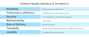
Source: AltexSoft.com
- Reliability. Refers to the level of danger inherent in a software product and the chance it will certainly fail. This metric is related to “security,” as called by ISO: how likely is it for regressions to appear when changes are made?
- Performance. In the CISQ software program quality model, this metric is referred to as “Efficiency.” Generally, software program efficiency relies on how its source code is created, its software application design, the elements within that design (databases, web servers, and so on) as well as its scalability alternatives.
- Security. Security (in the context of software application quality) shows how likely it is that hackers could break the software application, disrupt its activity or access delicate information, as a result of poor coding methods or style. A central idea is to determine the weaknesses that can cause a security issue or violation. The number and extent of vulnerabilities found in a system is a vital sign of its level of security, as well as is usually a factor to hold off the launch and repair these vulnerabilities.
- Maintainability and code quality. Software maintainability gauges the simplicity of which software application can be adapted to other objectives, how mobile it is between different environments, and whether it is transferable from one team or from one product to another. Maintainability is one of the code performance indicators. If the code is of premium quality, the software is most likely to be extra maintainable.
- Delivery Rate. In agile environments, new iterations of software are supplied to users very promptly. Agile methodology suggests that delivery rate is crucial because the more often the software is delivered, the more feedback about user experience is received, and the more possibilities there are for improving quality.
Why you should start tracking QA metrics
It is important to measure and track metrics simultaneously in different types of the software development process, like unit testing, in order to detect common, root problems, and be able to customize and optimize the entire testing process. And most importantly, QA metrics allow discovering some problems, which sometimes can remain unnoticed by the team.
![]()
Source: qa.world
The most common problems include the lack of communication between development and QA teams, ineffective planning and deadline estimation, and instability of the system under test. Frequent changes in product requirements or software configurations can be a major issue too.
KPIs for your QA team
Now let’s go through the main KPIs that you can use to measure your Quality Control and Assurance team’s progress:
- Regression coefficient
The purpose of the regression coefficient is to show how the efforts of the team are being distributed. The closer the coefficient is to 0, the fewer errors were introduced into the existing functionality when implementing new requirements. If the value is greater than 0.5, then the team has spent more than half of the time restoring previously working software functions.
- Rediscovered defects/bugs rate
This rate serves the purpose of assessing the quality of development and fixing bugs, as well as the complexity of a product or an individual module. The closer the calculated value of this metric is to 0, the fewer old mistakes are repeated during development.
If the coefficient turns out to be more than 0.2, this may indicate either the technical complexity of the module, or the clumsy architecture or that the previous fix was made poorly.

Source: bankinfosecurity.com
- Average bugfix cost
This metric means the ratio of the total costs incurred by the team when working with all product defects (for example, within the framework of a release) to the total number of defects.
The purpose of the metric is to show how expensive it is to detect and fix each defect. This will make it possible to calculate the benefits of reducing the number of errors made. Of course, there are no correct values here, everything will be determined by the specifics of a particular situation.
- Testing performance
The purpose of the metric is to show how many errors can our test cases detect on average. This metric reflects the quality of the test design and helps to track the trend of its change. It also allows you to monitor the effectiveness of each of the test sets, how it changes over time and supplement them with “fresh” tests.
- Rate of errors missed per production
This is the number of bugs found after release or the total number of software bugs found during testing and after release. The purpose of the metric is to demonstrate the quality of testing and the efficiency of error detection – what percentage of defects was filtered out and what percentage went to production.
The acceptable percentage of errors that were missed on production will depend on many factors. However, if the coefficient is>0.1, it gets worse. This means that every tenth defect was not found during testing and led to problems in software already delivered to users.